

The importance of accessible typography
Whenever I do a UX or UI review – and I do many – typography is most often a sore point. Interestingly, it is also an essential component of the interface of any digital product you need to build.
In fact I would argue that typography is the most important element in any user interface.
It’s also still about 95% of the web! This is a bit of a wild estimation that I can’t in any way back up with actual data, but I feel confident that this bold claim is not too far from the truth.
The good news is that typography is the easiest, fastest and most affordable way to immediately improve the conversions of any site. Accessible typography means that your site is readable by screen readers, and that anybody visiting your site will be able to use it.
Learning about typography and implementing your knowledge is a sure-fire way of increasing your audience by as much as 25%: this is the approximate percentage of people experience a form of disability that are on the web at any one time.
So let’s start from the beginning: the difference between font and typeface.
The mechanics of the difference between font and typeface
You may not even be aware of the fact that there is indeed a difference between font and typeface. In fact, I’m sure that you’ve heard the terms ‘font’ and ‘typeface’ used interchangeably. And you probably never gave it another thought.
In fact, I often I catch myself using the term ‘font’ when ‘typeface’ would be the correct one.
But does it matter in the end? Or is it just a boring punctualisation by type pedants lording it over the ignorant masses?
The truth is that from a certain point of view it doesn’t matter at all. I wouldn’t correct you if I noticed that you said ‘font’ where you should have said ‘typeface’.
I read a Fast Company article on the subject: they interviewed various famous designers, who all seemed to agree that you’d have to be a bit of a type nerd in order to get annoyed. Mind you, I do know a few type-obsessed designers who might not make their annoyance public – but they’re definitely seething internally when they hear the terms used incorrectly.
For mere mortals, the distinction simply isn’t as important as it used to be when there was a real reason for it.
Having said all this, I still think that if you are keen to understand how to create an accessible experience with the typography of the products you design, ultimately leading to more conversions, it can be very useful to understand the difference between font and typeface.
Knowing this difference will make it easier for you to make the right choices when you are faced with type decisions. If you choose too many typefaces, for instance, you may end up with a slow site that presents cognitive overload for users: both big blocks for good UX, accessibility and conversions
So, let’s find out what is a typeface exactly.
What’s in a typeface
A typeface is a collection of characters sharing the same design features. You can also say that a typeface is a family of fonts.
Just like real families, typefaces have different characters inside it. And you can even have more than one family within the same family, sharing the same surname.
Example: ‘Freight’ is the denomination for a number of different font families, or typefaces. Under the name ‘Freight’ you can find Freight Sans, Freight Big, Fright Neo, Freight Text.
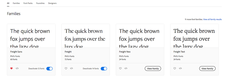
Then if you look closer, you can see that each of these font families (or typefaces) contains a number of fonts.
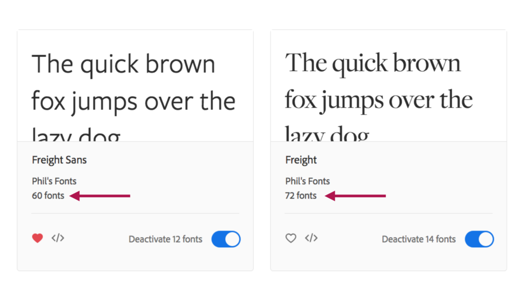
This, by the way, makes me like Freight a lot: I know that I will be spoiled for choice of weights and styles if I choose Freight for my projects. With a font family like Freight, you don’t really need any other typeface to create hierarchy as well as visual interest.
What’s in a font
That’s what a font is: FreightBigProItalic is one of the 72 fonts within the FreightBig family. Each variation – Light, Book, Medium, etc, with all their Italic versions, is a font. All together they form the font family (or typeface).
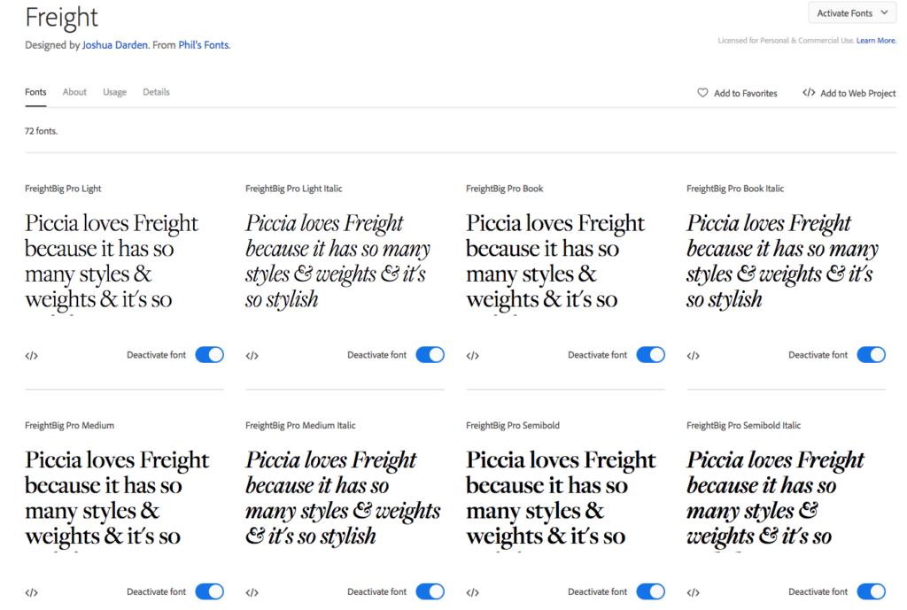
In fact, in the old times every single size of type and every single character, let’s say Freight Sans Pro Black body size 160 letter Z, was 1 font. This is because each individual character had to be fused and then typeset.
Here’s a definition of font (from Wikipedia):
“Each font of a typeface has a specific weight, style, condensation, width, slant, italicisation, ornamentation, and designer or foundry.”
If you are into useless etymology (I know I am), you will be pleased to read this article explaining the origins of the term ‘font’. The TL;DR version: a bastardisation of the Old French word to indicate a piece of movable type made from melted lead.
2 main reasons why this knowledge will help you
As said above – in a way if you don’t care it’s just fine. Carry on using the terms interchangeably and very few people will notice.
However, knowing the difference between the terms can really come in handy when you are charged with the delicate task of selecting the typography for a website (or anything else).
If you’ve been designing on the web for a while, you’ve probably heard before that the fewer the fonts in a website or app, the better.
Why? Two main reasons:
- Having to load and visualise too many fonts may cause a website to be slow
- Too many different fonts may cause cognitive overload, making the content more difficult to comprehend and navigate
So it’s important to understand that when I say ‘Pick just one typeface’, I mean:
– Pick:
FreightBig only
On the other hand, when I say ‘Pick up to 3 fonts’, I mean:
– Pick:
FreightBig Pro Book
FreightBig Pro Book Italic
FreightBig Pro Bold
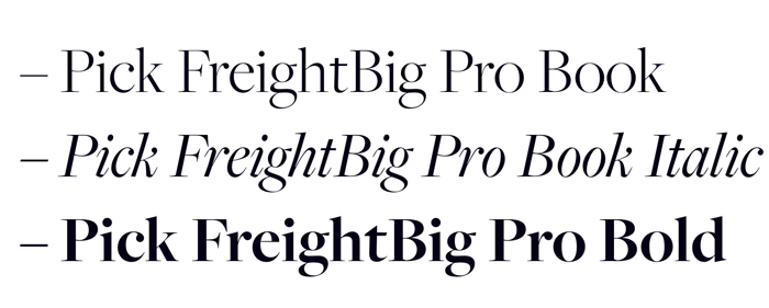
Which means 3 fonts from within the same typeface/ font family (these two terms indicate the same thing).
And I do NOT mean pick up to 3 typefaces, because that might slow your site down a lot as well as making it look like a big visual car crash. Which will drive your users away.
Even if they are not bothered aesthetically, too many typefaces require way too much brain energy to be interpreted, and there just ain’t no time for that these days.
I also do not mean ‘Pick 3 fonts from 3 different typefaces’ because that would ensure the Ling effect – and only Ling can get away with it and still have a thriving business.
So, while only a typography nerd will berate you for not using the two terms correctly, I do think that there is a practical advantage to knowing the difference between font and typeface.
This knowledge is, in fact, the first step towards accessible typography that helps your sites convert more.
The advantages of picking just one typeface
I am a big proponent of the use of just one typeface. Choosing and pairing different typefaces that go well together is one of the things that non-designers, or even seasoned designers who are less versed in the art of typography, struggle with the most.
So why make your own life difficult? Don’t pick too many fonts.
When you pick just one typeface that has plenty of styles and weights, these will be your main advantages:
- Your website will be faster, and therefore easier to navigate and with better UX
- Your branding will be stronger, which will lead to more consumer trust
- The cognitive load on your visitor will be lower, which means better accessibility and UX
- You will still be able to differentiate the various elements of your interface thanks to the variety of styles and weights

For instance, Google Fonts has a very handy “Font properties” filter that allows you to select typefaces according to the number of styles they have.
My single (almost) typeface choice on this website
I did tell you further up that I do love the Freight families of fonts. I particularly love Freight Big Pro, in fact. However, Freight Big Pro is great for headings, but it’s not so good for body text. Why? Well, it simply doesn’t have enough contrast to be properly readable – even though it’s oh so pretty.
The solution is very easy: there is a Text option in the Freight family that allows me to keep it in the family, excuse the pun.
So here was my initial decision:
- Freight Big Pro for headings
- Freight Text for body text
- Brandon Grotesque, a sans-serif font used very sparingly for smaller text elements
Ehm, I can hear you say, this is not just one – technically, these are 3 typefaces.
I know! The good news is: 1 to 3 typefaces is actually fine. I could argue that for the main text elements I am in fact only using one, which is true from the cognitive load point of view. However, I won’t argue. I am happy to admit that I am not quite practising what I preach, but I am giving you a very viable, real-life example of a sensible typography choice.
Actually, 2 typefaces in the end
However, since first writing this post I have had to make amends: Freight Big Pro, while very pretty, is ultimately not completely accessible, because it has very high contrast in a lot of its type forms. This means that some elements of its anatomy are only a pixel thick, and they are not perfectly legible for someone who may have blurred vision.
So it was with a heavy heart that I switched all the headings to the same typeface as the body copy: the sensible and reliable Freight Text. Am I happy? No, although I’ll live. Is my typography more accessible now? Yes, it is. And that’s all that matters.
This all boils down to the fact that perfection does not exist. I am not perfect: but I do always do my level best to put people first. All my choices are made silencing my own vanity, in favour of what is more usable, accessible and inclusive. Do I always get it right? Hell, no! But I try…
Try the single typeface option in your next project! And let me know how it works out…
If you’re keen to learn more and create websites that convert more thanks to great typography, I have a course for you: the Accessible Typography course.
If you’re not ready for a course yet, start from downloading the 3 type tips PDF for your first steps towards more accessible typography.
